Product Design
Beacon
Project Overview
The "loneliness epidemic" wave
Problem Space
Lack of friends in young adults.
In young adults age 18-27
2020 Cigna study which surveyed 10,000 adults across the United States
Causes of Loneliness
Big life change (Moving, Death etc)
Personality
(shy, introverted, etc)
Symptom of psychological disorder
Negative Effects of Loneliness
Decreased Memory
Depression
Poor decision making
Current Preventions
Build quality relationships
Strengthen Existing Relationships
Talk to someone
Understanding the problem
During the early stages of adulthood, young adults experience big life transitions (job, school, moving) impacting their connection with friends and family.

Assumptions
Helping millennials form quality friendships through shared interests and opportunities can decrease the percentage of loneliness in young adults.
Questionnaire & User Interviews
Talking to young adults and understanding their experiences.
Participant Criteria
Synthesized Insights
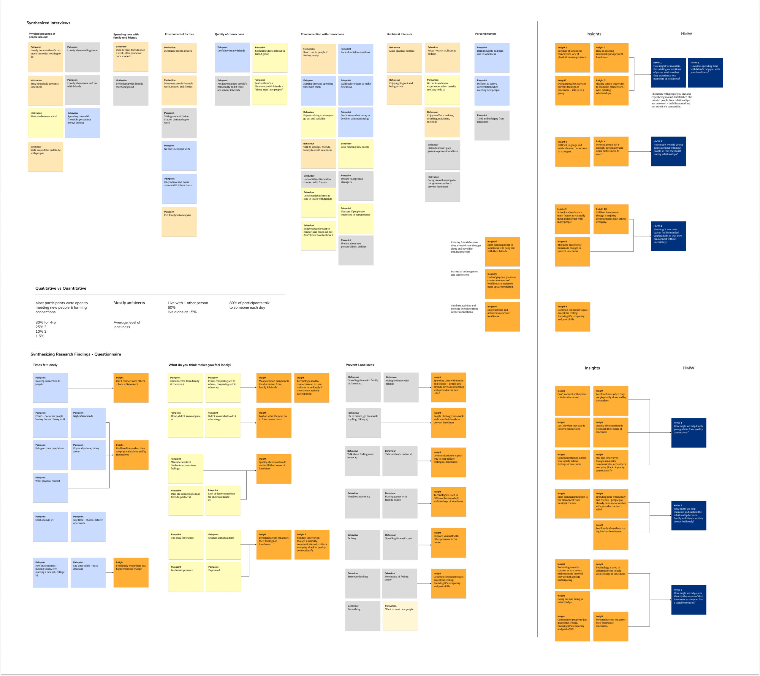
Old friends are better than new ones.
- Most young adults prevented loneliness by spending time with friends and family
- It's difficult to form quality connections with strangers
- Having a mutual interest and matching personalities is more important than meeting people
- Quality time is important to maintaining existing relationships
- Lack of physical presence increases feelings of loneliness
Behaviours
Findings
• Goes to the gym and being active
• Use social media to connect with friends
• Meet friends less often
• Plays & listens to music
Motivations
Findings
• Meet new people at work
• To go on more walks
• Try to hang with friends more
• Wants to be more social
• Seek out new experiences
Pain Points
Findings
• Difficult to make time for friends
• Feels left out of friend group
• Can’t tell if new connections will click
• Socially awkward
• Feels tired and unhappy due to loneliness
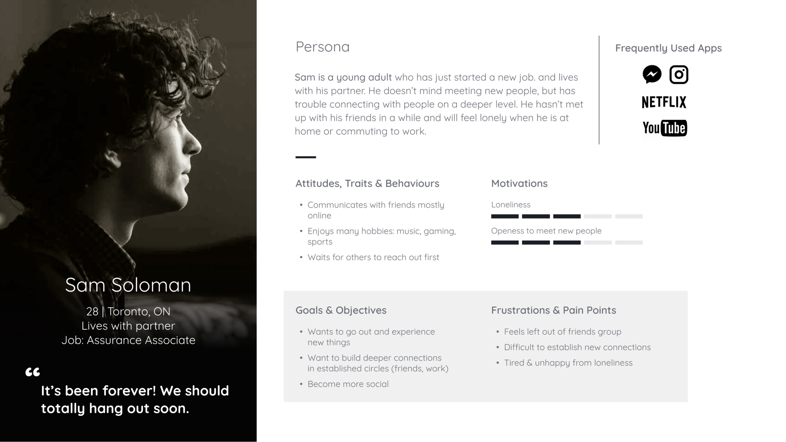
Person
Insights to Persona
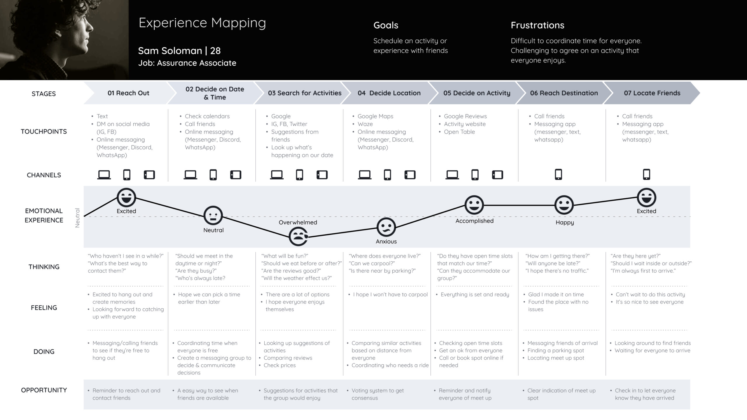
I created a persona that encompasses the new findings based on the behaviours, motivations, and pain points from my research and interviews. Millennials’ busy lives made it difficult to coordinate meetups with existing friends.
Reassessing my HMW
How might we maintain the existing friendships of young adults so that they experience fewer moments of loneliness?
User Stories & Epics
Determining app features
Planning meetups is not a linear process. Location, time, people and other factors can influence the plan. Due to the time limitations of this project it was important to choose the crucial features. These 5 epics were synthesized forming the features this app will contain in order to meet the user’s needs.
Epics
Plan and coordinate times between friends
Notification
Set specific reminders to meet up and reach out to friends
Relationship Building
Share and nuture similar hobbies or interests between friends
Proximity & Location
Find nearby friends for impromptu meetups
Communication
Message and talk to friends to stay in touch
Chosen Epic
Proximity & Scheduling
As a user I want to...
- ..see nearby friends so that I can reach out for a quick get together.
- ...be reminded to reach out to specific friends so that I can stay in touch
- ...create groups in my friend list so that I can organize my friends
- ...get notified if someone is free to hangout so that I know who is available
- ...import my existing contacts so that I don't have to manually input their information
- ...know my friends location so that I can get updates on their status
- ...send open invitations so that anyone who is free can attend
- ...message nearby friends so that we can discuss the details of our plan
- ...recieve suggested nearby locations so that we are provided with nearby options
- ...voting system so that decisions can be reached in a coherent manner quickly
Main Task Flow
Combining business and user needs.
As a busy adult, I want to see if there are nearby friends for spontaneous meet-ups
Develop
From sketches to wireframing.
Main Screens Breakdown
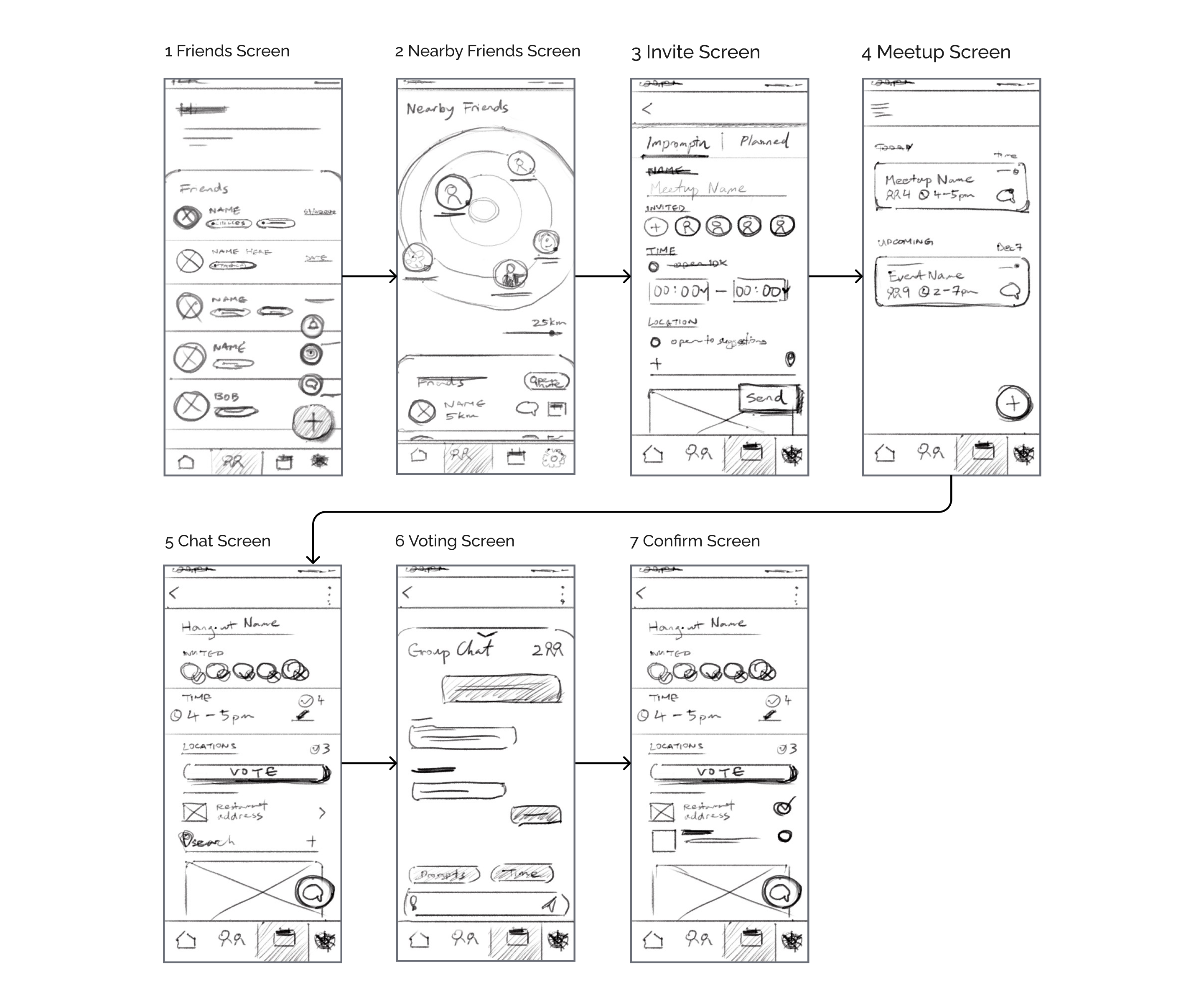
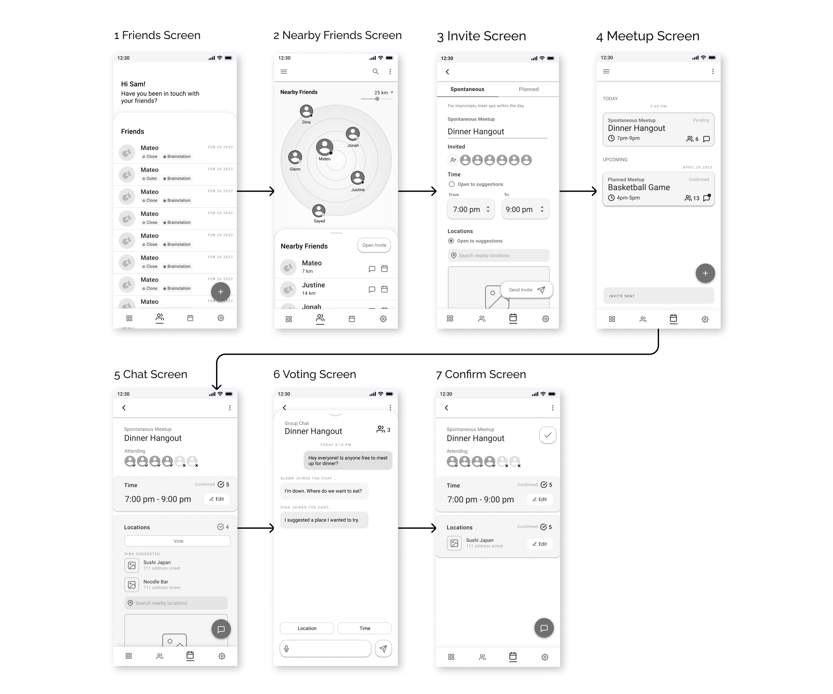
Version 1 - User Flow
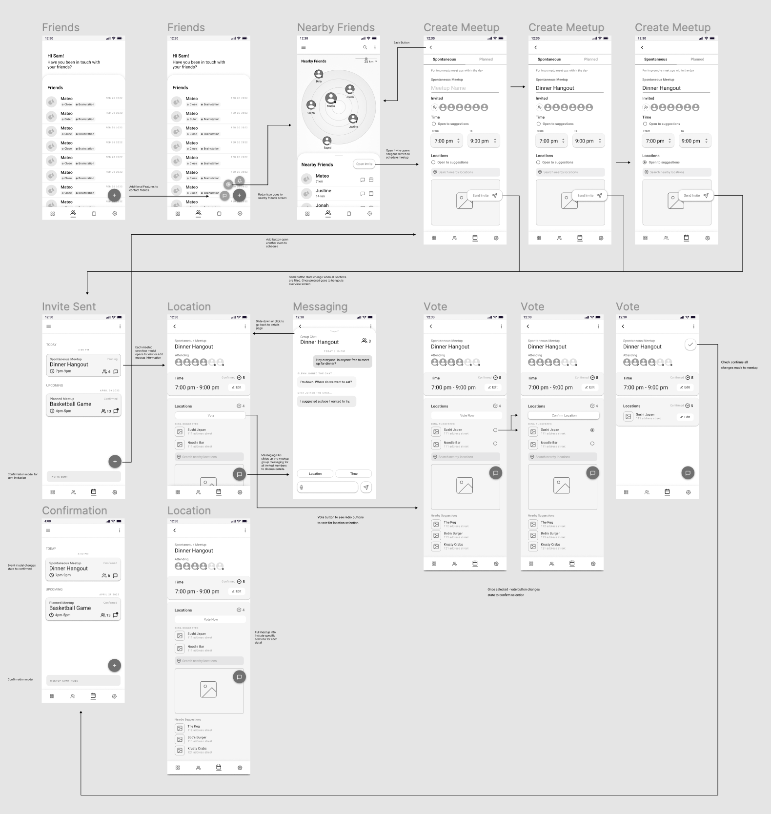
User Testing
Improving experience through real user feedback.
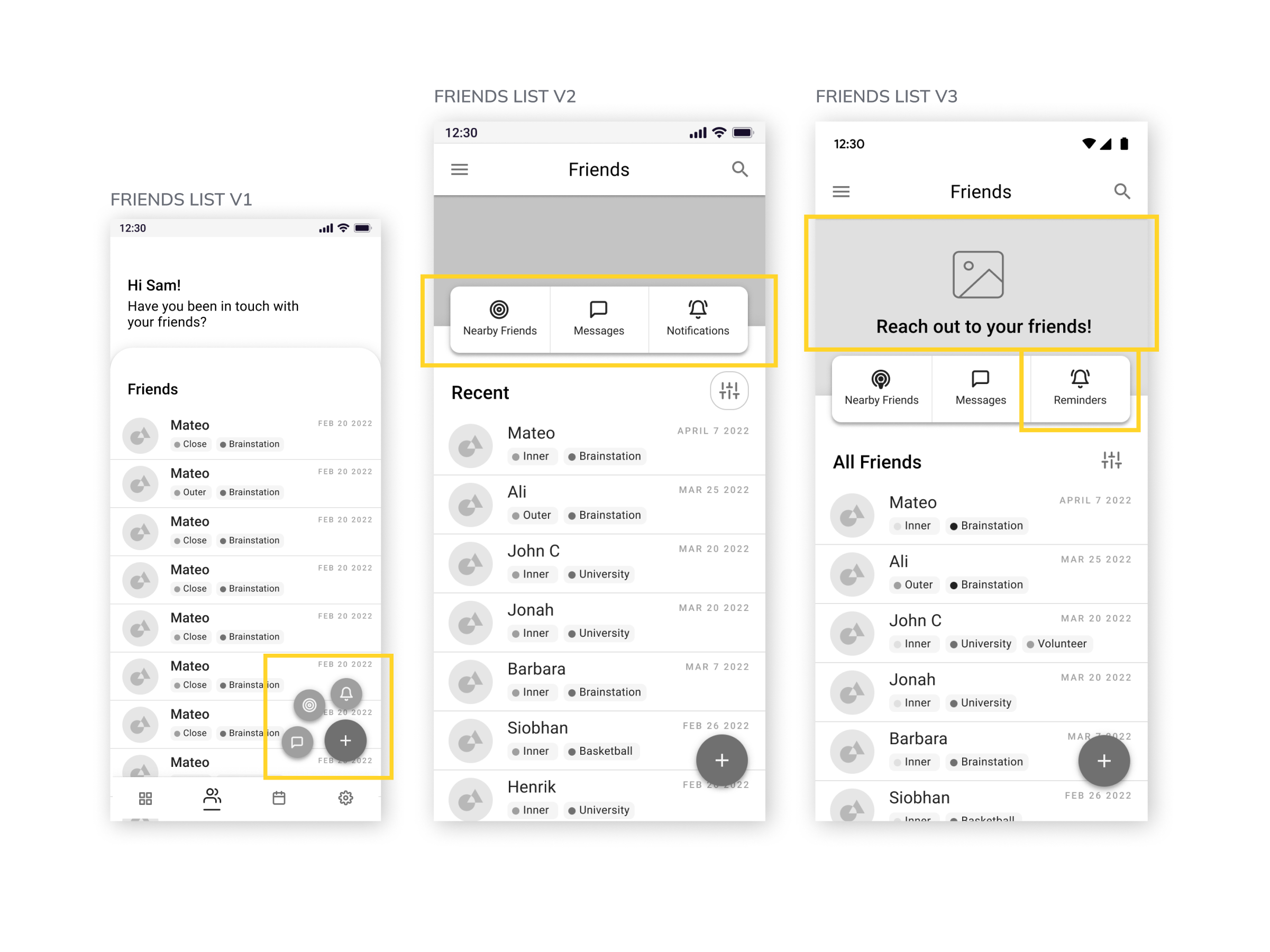
Key changes
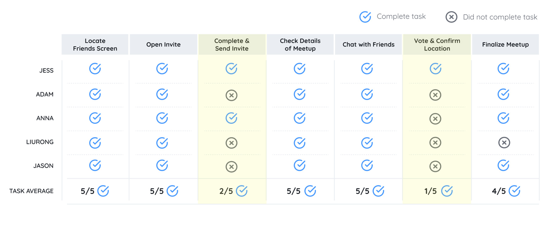
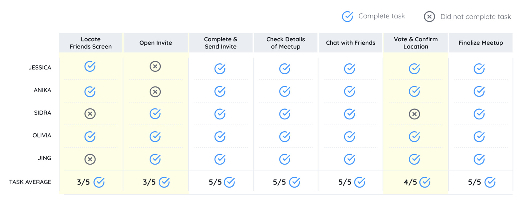
Clarifying button function
Didn't know there are more buttons in the floating action button.
I can't tell what the icons mean.
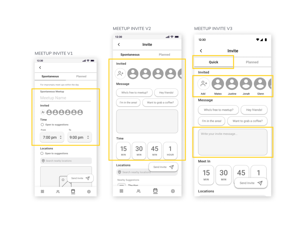
Key changes
Understanding user's needs
If I plan a meet up in more than 2hours, it's a planned hangout.
Deliver
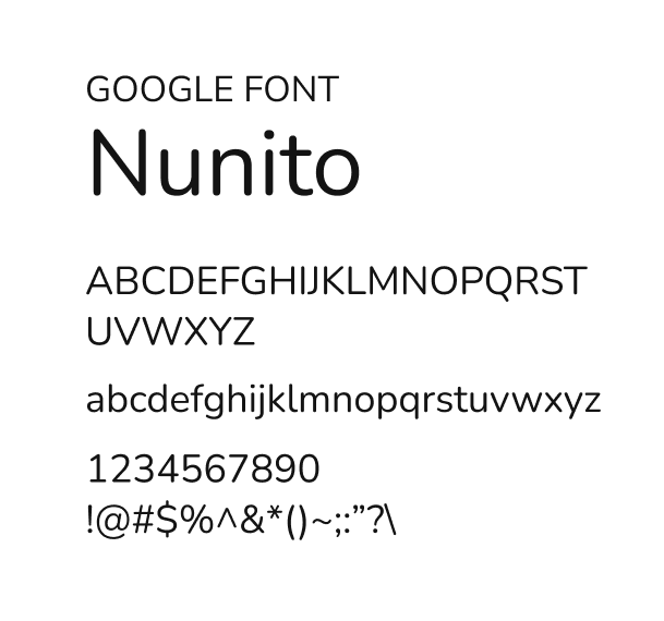
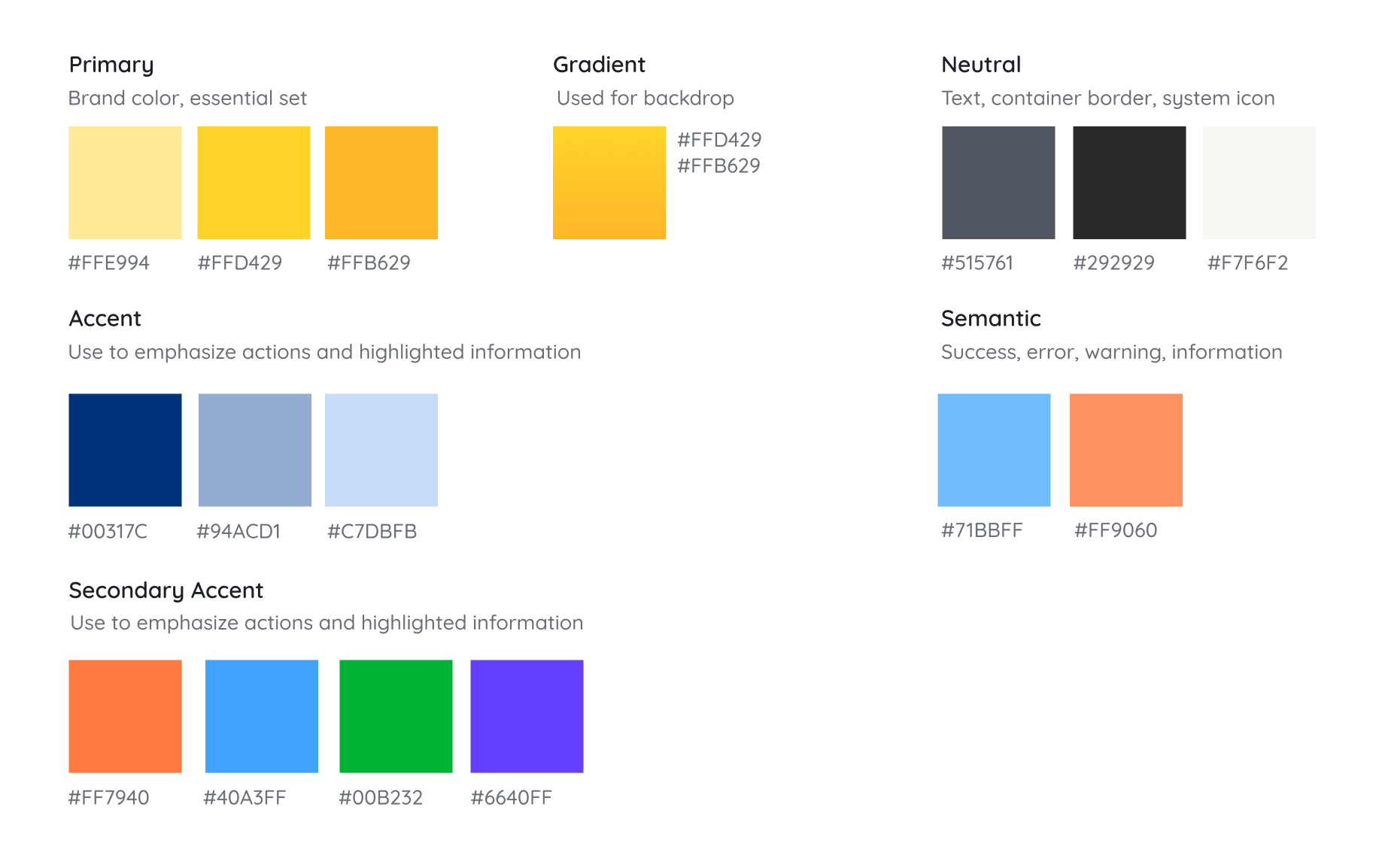
Creating the mood with a brand identity.

Beacon in the market.

App Solution
Beacon
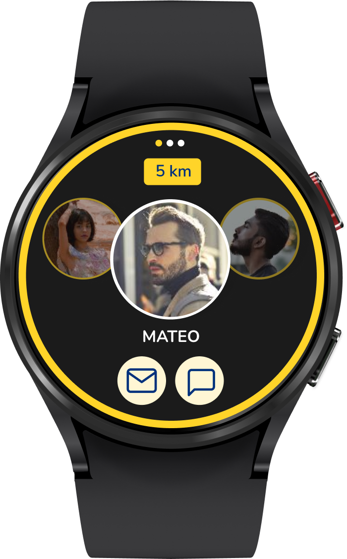
Smart watch
Expanding to other platforms
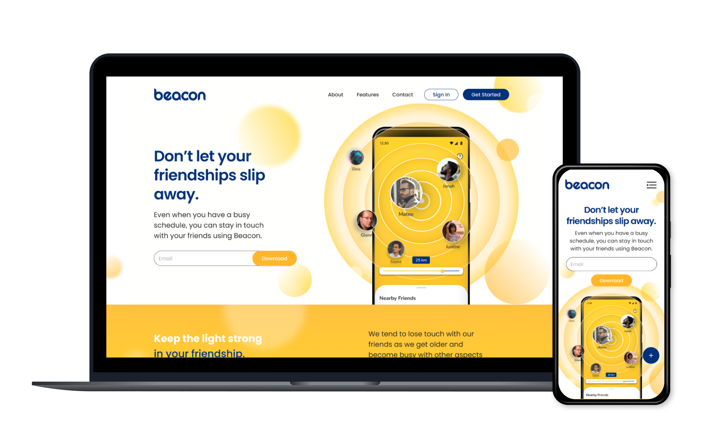
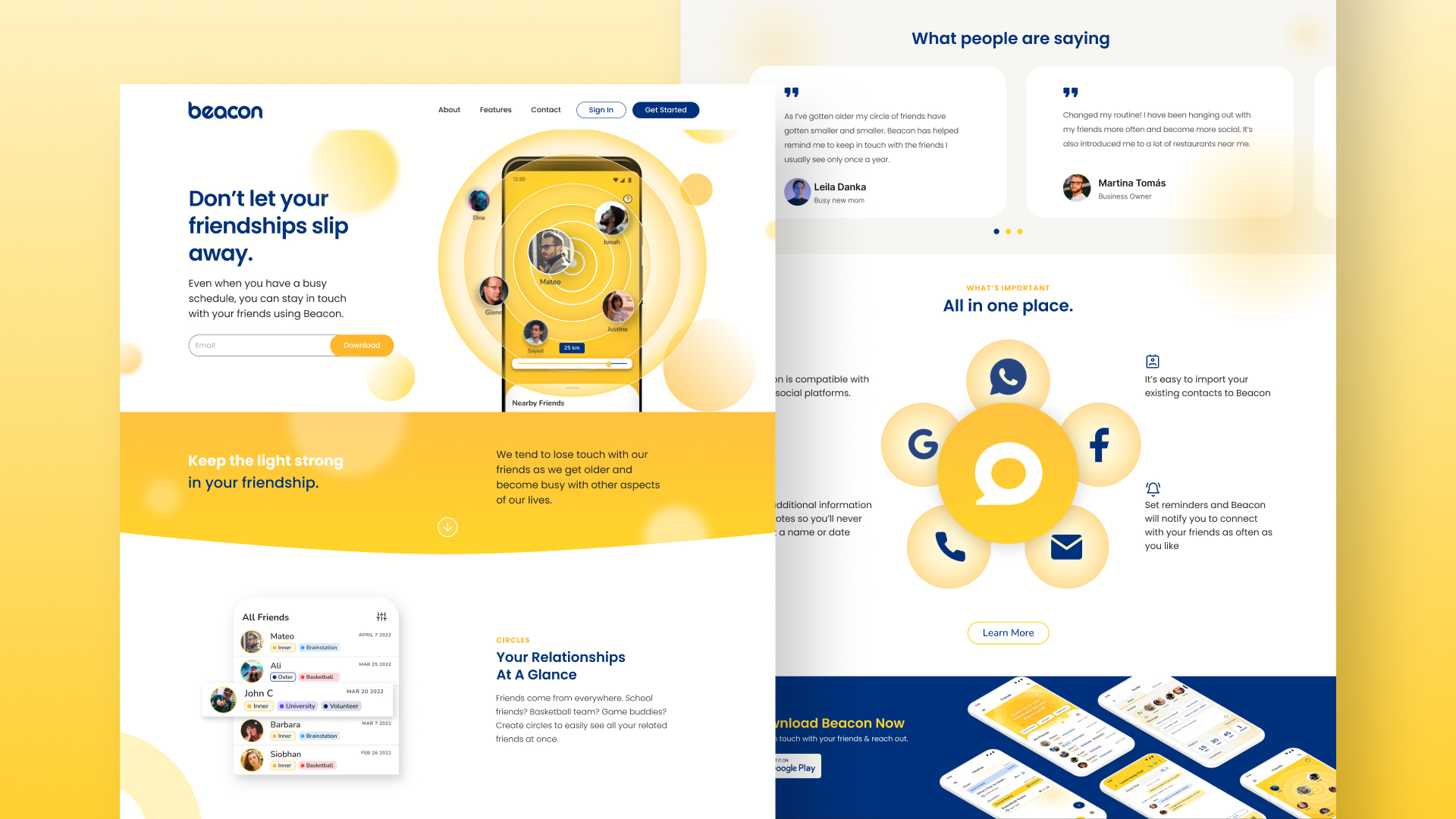
Marketing Web Design
Promoting the app.
Key Learnings
A research driven solution.
Design Impact
Project reflection and future improvements.
To explore the impact of my product, I utilized the
The Big Bad Wolf Card
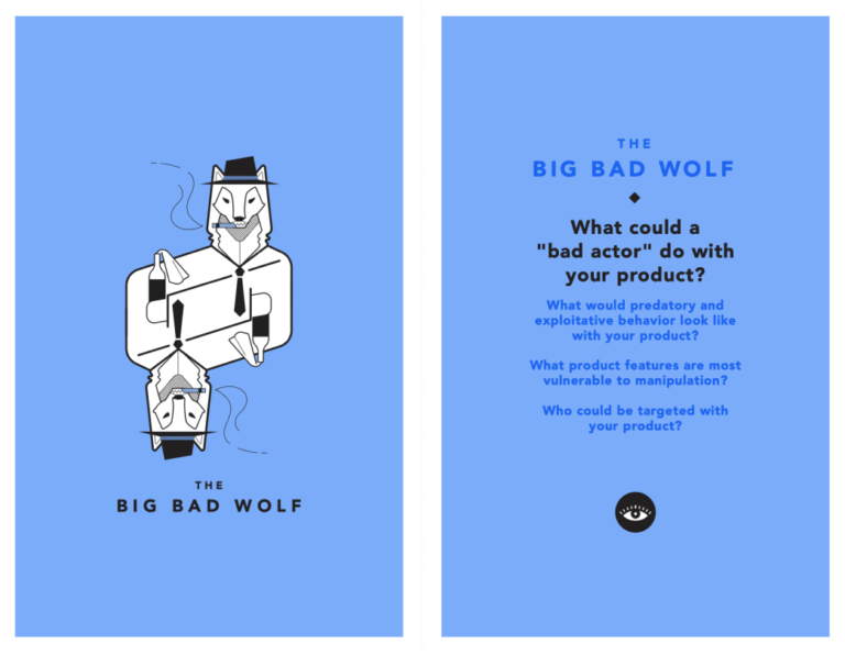
A collection of provocations designed to help creators consider the impact of technology.
